Google Sheets Integration
GA4 to Google Sheets
By SyncWith
GA4 Google Sheets integration
The SyncWith Google Sheets addon enables you to connect GA4 to Google Sheets to automate imports of your traffic, events, conversions, goals and more and more from your websites. Fast. Easy. Free to get started.
Install the Addon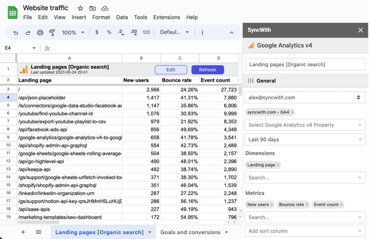
Easily build custom GA4 reports in Google Sheets
The GA4 integration gives you the power to slice and dice your google analytics data to get the insights you need for your business.
Schedule automatic updates
Automatically update your Google Analytics data daily, hourly or every five minutes
Pull data from dozens of dimensions and metrics
From high-level summary to nitty-gritty details, we've got you covered, whatever you're looking to report on. Pull traffic, sessions, events, converisons, landing pages and more
Unlimited data
Whether you're tracking data for in-house purposes, or creating reports for hundreds of clients at an agency, you're not limited.
Chart and analyze data
Use the power of Google Sheets to add charts, sparklines, pivot tables and more
Example GA4 Reports you can build in Google Sheets
 Landing pages report The Google Analytics Landing Page report is a powerful analytic tool that provides key insights into the first pages users visit (landing pages) when they come to your website. This report offers valuable information on user behavior metrics such as the number of sessions, bounce rates, average session duration, and conversion rates specific to each landing page. It serves as a vital resource for understanding which pages are effectively attracting and engaging users, facilitating in-depth analysis of content performance, SEO success, and the efficacy of marketing campaigns. Moreover, it supports strategic decisions around content creation, website usability enhancements, A/B testing, and ad performance optimization. In short, the Landing Page report is essential for making data-driven decisions that can significantly improve a website's user engagement and conversion outcomes.
- Conversion & Event Reports Google Analytics Conversion and Event Reports are essential tools for tracking and understanding user interaction and goal completion on a website. The Conversion Reports allow businesses to monitor key performance indicators like form completions, purchases, or time spent on a page, reflecting the effectiveness of a site in achieving its intended goals. The reports can be customized based on different types of conversions, or goals, set up by the user. Event Reports, on the other hand, track specific user interactions, such as clicks on a button, downloads, or video views. These reports offer granular insights into how users interact with specific elements of a site, providing valuable information for optimizing user experience and increasing conversion rates.
- Acquisition Overview Report The Google Analytics Acquisition Overview Report is a comprehensive tool that helps understand where your website's traffic is coming from, essentially providing insights into your audience's acquisition channels. It breaks down traffic sources into categories like Organic Search, Direct, Social, Referral, Paid Search, and others. This enables you to identify which channels are driving the most traffic, engaging users, and leading to conversions. The report also connects with the Behavior and Conversion sections, providing insights into how users from each source interact with your site and their conversion rates. With this data, you can optimize your marketing strategies, improve your allocation of resources across channels, and identify areas for potential growth.